


Do red deposit buttons in online casinos really convert better?
Updated 9 Oct 2026•Published 9 Oct 2026
Key takeaways
- E-commerce tests built the myth: casinos adopted red-button conventions without building gambling-specific evidence of their own.
- No colour converts best: users respond to clarity, contrast and context — not to red or green in isolation.
- HubSpot warned against universals: test CTA colours within each website's own context instead of copying famous experiments.
- Regulators assess choice architecture: the CMA and the European Commission examine how whole interfaces steer decisions, not single elements.
- Combined pressure raises risk: urgency prompts, hidden withdrawals and muted safer gambling tools concern regulators far more than any button colour.
- Use colour to inform: apply it to accessibility, system status and navigation — never to accelerate financial decisions.
- Flexible platforms adapt faster: configurable interfaces let operators respond to new evidence and regulation without redevelopment.
The red deposit button has become such a familiar part of online casino design that its purpose is rarely ever questioned. Bright, visually dominant calls to action have long been considered a simple way to encourage deposits, influenced by the popular belief that certain colours create urgency and improve conversion.
The problem is that the evidence has never been quite that cut-and-dried.
Much of the thinking behind colour-led calls to action originated in e-commerce, where isolated A/B tests demonstrated that changing a button's colour could influence user behaviour within a particular page layout. Over time, those findings became accepted design conventions across many digital industries, including online gambling, despite relatively little publicly available casino-specific evidence to support the idea.
At the same time, regulators are paying closer attention to how digital interfaces influence financial decisions. Rather than focusing on one particular colour, they are increasingly examining whether interface design creates unnecessary urgency, steers player behaviour or diminishes informed choice.
This changes the question operators should be asking. Instead of looking for the colour that supposedly converts best, the more important challenge is whether long-established design conventions still make sense when both the available evidence and regulatory expectations have evolved.
Why certain colours became standard in casino design
For over two decades now, colour has been treated as an important variable in the optimisation of digital conversion. Marketers have experimented with button colours, wording, placement and visual contrast in an effort to encourage users to complete a desired action. Some of the most widely cited A/B tests, including early experiments comparing red and green call-to-action buttons, suggested that changing a button's appearance could influence click-through rates within a specific page layout.
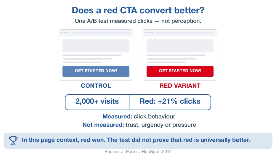
Over time, these experiments became some of the best-known examples of conversion rate optimisation (CRO). However, it is true to say that the organisations that conducted many of these tests also cautioned against drawing universal conclusions. HubSpot, for example, notes in its PDF publication ‘An Introduction to A/B Testing’ that there is no single ‘best’ CTA (call-to-action) colour and recommends testing colours within the context of each individual website, where factors such as contrast, surrounding content and overall page design can typically matter more than the colour itself.
What is striking is how little comparable research exists for online gambling. Despite colour becoming a familiar feature of casino interface design, there is relatively little publicly available evidence examining whether particular colours influence player behaviour differently within gambling environments. Much of the published discussion continues to draw on studies from retail websites, landing pages and digital marketing rather than casino-specific research.
As a result, the online gambling industry appears to have adopted many of the broader digital design conventions for call-to-action buttons without building an equally conclusive evidence base of its own.
Here’s why colour alone does not determine conversion
Colour is one of the most discussed variables in digital interface design, but, significantly, not always the most important. Decades of user experience (UX) research have shown that people do not interact with interface elements on their own. Instead, they respond to the entire visual environment, including layout, contrast, wording, spacing, hierarchy, accessibility and the expectations created by the surrounding interface. Colour contributes to that experience, but it is only one part of a much larger system.
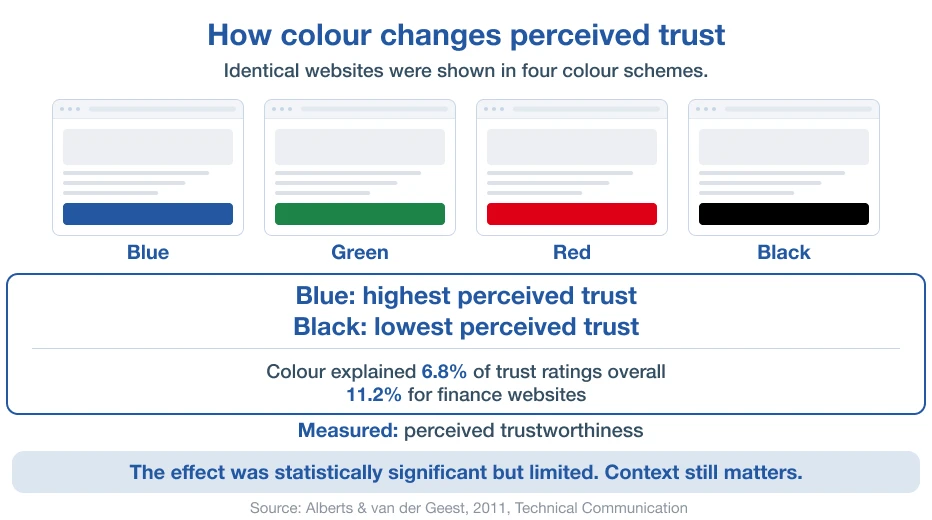
Studies examining CTA colours have produced inconsistent results. A button that performs well on one website may produce entirely different results on another because users respond to the relationship between the button and its surroundings.
For instance, imagine, if you will, two identical red deposit buttons. One appears within a clean, well-structured interface where the next step is obvious, and the action feels trustworthy. The other rests on a cluttered page, competing with flashing promotions, multiple banners, and inconsistent navigation. Despite the buttons sharing the same colour, users will not necessarily respond to them in the same way.
Changing a button from red to green does not automatically improve its effectiveness. Two interfaces using the same colour can still produce very different outcomes depending on the overall design. Equally, two well-designed interfaces with different button colours may produce remarkably similar outcomes because users respond to clarity, confidence and ease of task completion rather than to colour alone.
For casino operators, that clarification matters. The available evidence does not identify a universally highest-converting CTA colour. Instead, it suggests that successful interface design depends on how visual elements work together to support user understanding and decision-making. That alone challenges one of the longest-standing assumptions in digital interface design.
If colour isn't a determining factor, then what are regulators concerned about?
Perhaps the biggest change in recent years is not the colour of call-to-action buttons, but the way regulators evaluate digital interfaces. Increasingly, the discussion has pivoted from individual design elements towards choice architecture, the combination of visual cues, layouts and interaction patterns that influence how people make decisions online.
Consumer and digital regulators are paying more attention to dark patterns, specifically interface designs that steer users towards particular actions through unnecessary pressure, unequal prominence or misleading presentation rather than informed choice. Guidance from key organisations, including the UK Competition and Markets Authority (CMA) and the European Commission, highlights practices such as visual interference, artificial urgency, and the unequal prominence of competing options as areas of increasing regulatory concern. Rather than assessing colours in isolation, regulators are considering how the overall interface influences consumer behaviour.
For casino operators, the concern is not whether a deposit button happens to be red. It is whether the complete interface uses visual design to place disproportionate pressure on spending decisions, or to make alternative choices less visible or more difficult to complete.
A clearly identifiable deposit button that sits within a balanced, transparent interface is unlikely to raise concern. By contrast, an interface that combines an oversized, highly animated deposit button with countdown messages, repeated urgency prompts, hidden withdrawal options or muted safer gambling controls presents a very different picture. Individually, each design choice may appear insignificant. Together, however, they can create an experience that encourages action through pressure rather than informed decision-making.
Viewed in that context, colour becomes just one component of a much bigger design question. Does the interface help players make informed choices, or does it subtly steer them towards the outcome the operator prefers?
Colour should help players decide, not add pressure
Colour is one of the most effective tools available to interface designers, but its value depends entirely on how it is used. Well-designed casino interfaces use colour to improve clarity, accessibility and navigation. Poorly considered implementations, on the other hand, can become part of a wider design that places unnecessary pressure on financial decisions.
For operators, a useful question is not whether a button should be red, blue or green, but whether every use of colour has a clear purpose. The following principles provide a practical framework for reviewing existing interface designs.
When colour supports informed choice
Colour is most effective when it helps players understand the interface rather than encouraging them towards a particular outcome. Examples include:
- Reinforcing brand identity through a consistent visual language.
- Improving accessibility by providing sufficient contrast and supporting users with different visual abilities.
- Communicating system status, such as successful deposits, completed withdrawals, warnings or errors.
- Creating a clear visual hierarchy that helps players distinguish between primary and secondary actions.
- Supporting navigation by making important interface elements easy to locate and understand.
- Improving readability so that information is easier to process across desktop and mobile devices.
Signs that colour may be influencing decisions
Colour becomes more difficult to justify when it contributes to an interface that creates pressure rather than understanding. Operators should review designs where colour is used alongside other persuasive techniques, for example:
- Creating artificial urgency around deposits or other financial actions.
- Making one action disproportionately prominent while alternative options receive little visual emphasis.
- Combining colour with countdown timers, scarcity messages or repeated prompts to accelerate decisions.
- Reducing the visibility of withdrawals, account settings or responsible gambling tools through muted colours or weak contrast.
- Using visual emphasis to reinforce emotional triggers, such as fear of missing out or loss framing.
- Drawing attention through excessive animation or flashing effects, where the objective is persuasion rather than clarity.
Good interface design helps users understand their choices. Poor interface design attempts to influence which choice they make. As regulators increasingly evaluate the overall decision-making experience rather than isolated interface elements, ensuring that every visual choice has a clear user-centred purpose is becoming an important part of casino interface design in 2026.
The new competitive advantage is adaptability
One of the clearest conclusions from the research is that interface design must continually adapt to changing circumstances. Regulatory expectations continue to evolve, behavioural research is expanding, accessibility standards are becoming more demanding, and player expectations change as digital experiences evolve. For these reasons, the design decisions that appear entirely appropriate today may require refinement tomorrow.
For operators, that creates a practical challenge. Updating an interface should not require a complete platform redevelopment every time evidence, regulation or branding matures. The ability to adjust colour palettes, button styling, visual hierarchy and other interface components is clearly an operational advantage.
This is particularly relevant when evaluating white-label casino platforms. Some solutions offer only limited control over visual elements, making it difficult to respond quickly to changing commercial or regulatory requirements. Others provide significantly greater flexibility, allowing operators to make interface improvements quickly without major development work.
That is where long-term platform design becomes just as important as functionality on launch day. A configurable interface enables operators to test new ideas, strengthen accessibility, maintain brand consistency and adapt to evolving expectations with considerably less operational effort.
Agreegain's casino platform has been designed with that flexibility in mind, giving operators extensive control over visual design, branding and interface configuration. Rather than locking businesses into yesterday's design assumptions, it provides the freedom to adapt the player experience as evidence, regulation and commercial priorities continue to evolve.
Popular blog posts